A productivity and mental health app for Wellesley students during the pandemic.
the name feel wellesley is a pun that seeks to highlight the dual purpose of the app: for students to improve their mental health (“Feel Well”), and for students to connect with other Wellesley students to feel like they have the same support system that they had when they were on campus (“Feel Wellesley”).
role Product Designer
team 2 Designers
timeline April - June 2021
Feel Wellesley is an app designed to help students improve their mental and academic resilience during this time of pandemic and civil unrest
the problem
When the Covid-19 pandemic hit, colleges were pushed to use Zoom as their main form of teaching. Wellesley students that are on campus or learning remotely because of the pandemic are experiencing a decrease in productivity and study motivation due to isolation. They are also feeling an increase in their stress levels due to the fast paced nature of the term system.
our solution
Feel Well is a mobile application that allows Wellesley sibs to connect while studying productively with built in de-stress mechanisms. To do this, our app will support three high-level tasks to address the needs of our target user population:
Increase productivity
Improve Mental Health
Monitor Personal Growth

emily
Age: 19
Sophomore currently on campus, diagnosed with ADHD recently.
Family: Single
Frustrations
Social distancing measures on campus makes it hard to study with friends.
The term system can be overwhelming, it is hard to manage deadlines.
The college did not provide enough counselling sessions or resources to help students with their mental health during this difficult time.
alex
Age: 21
Senior currently studying remotely in Tokyo.
Family: Single, living with her parents and two younger brothers.
Frustrations
She always starts her work close to the deadline.
The pandemic has decreased her opportunities to study and connect with friends.
Living with her family and the term system intensity can be overwhelming at times.
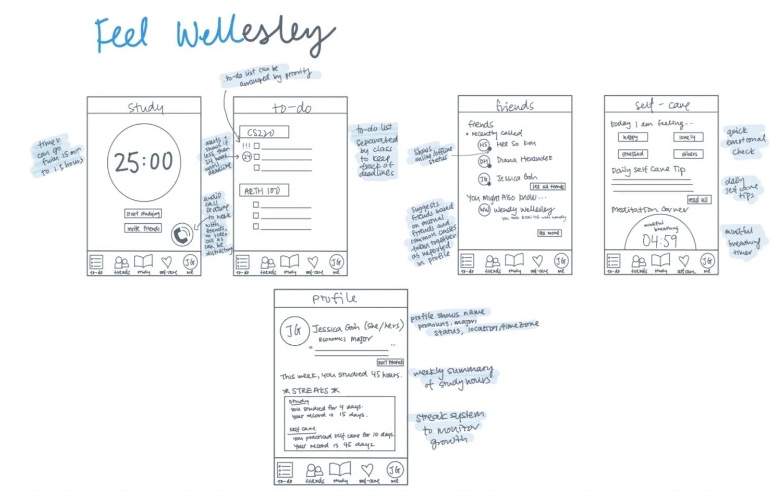
A similarity that was identified across interviewees was the preference and reliance on studying with a friend or classmate –– which they believed contributed to higher levels of productivity and motivation –– especially when working on complicated problem sets.Our app strives to solve this problem by having two main features: a study timer feature that students can set their designated study time and invite other online students to study together through voice call within the app, and a page designated to daily meditation exercises that also includes self care tips.
ideation
We created two preliminary designs
design 1
The app has five main tabs at the bottom: a to-do list, a friends list, a study timer, a self-care tab, and profile. To motivate students to study, we have a to-do list that has priority settings and deadline reminders to nudge students to start (and finish) their tasks. Under the study tab, students can set a study timer that goes from 15 minutes to 1.5 hours, and have the option to invite online friends to study together via voice call.
design 2
The process behind this design is with the intent of helping students feel more motivated to study as well as improve their mental health. In our user analysis,we found that many students find it more motivating to finish their work when they are working with another classmate or friend.
For this purpose students have the option of studying by themselves or with a friend under the study tab (icon of avatar holding book). The app has already installed breathing, mindfulness exercises as well as exercises that focus on the mind or a particular part of the body. With these meditation exercises they will train their attention and build awareness of their own mind and body. It will help them clear their mind and achieve an emotionally calm and stable state to continue their studies.
interactive prototyping
We created one low fidelity and one high fidelity prototype to conduct usability and heuristic user evaluation
brand style guide
high-fidelity prototype
Based on the feedback of the user testing from the previous prototype, we created a new high-fidelity prototype.
#1.Onboarding and Main Page
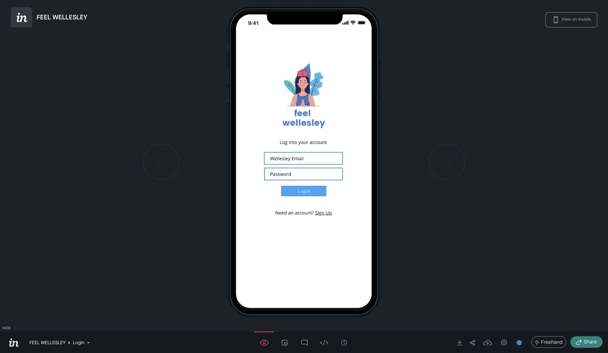
First-time users are brought to the onboarding pages that show the core elements of Feel Welleslesy. The main page lets the user choose between getting work done and practicing self care.
#2. Get Work Done Page
When the users click the Get Work Done button on the main page, users are brought to the studying section of the app. Users can set the duration of study and rest, write a to-do list, and invite their friends to study. If they want to move onto the self-care section of the app, they can do so by clicking the emotion button on the navigation bar.
#3. Practice Self-Care Page
On the Self-Care section of the app, users can write their daily journal entry, log their emotion of the day, and practice any kind of self-care with a timer.
#4. Friends and Profile Page
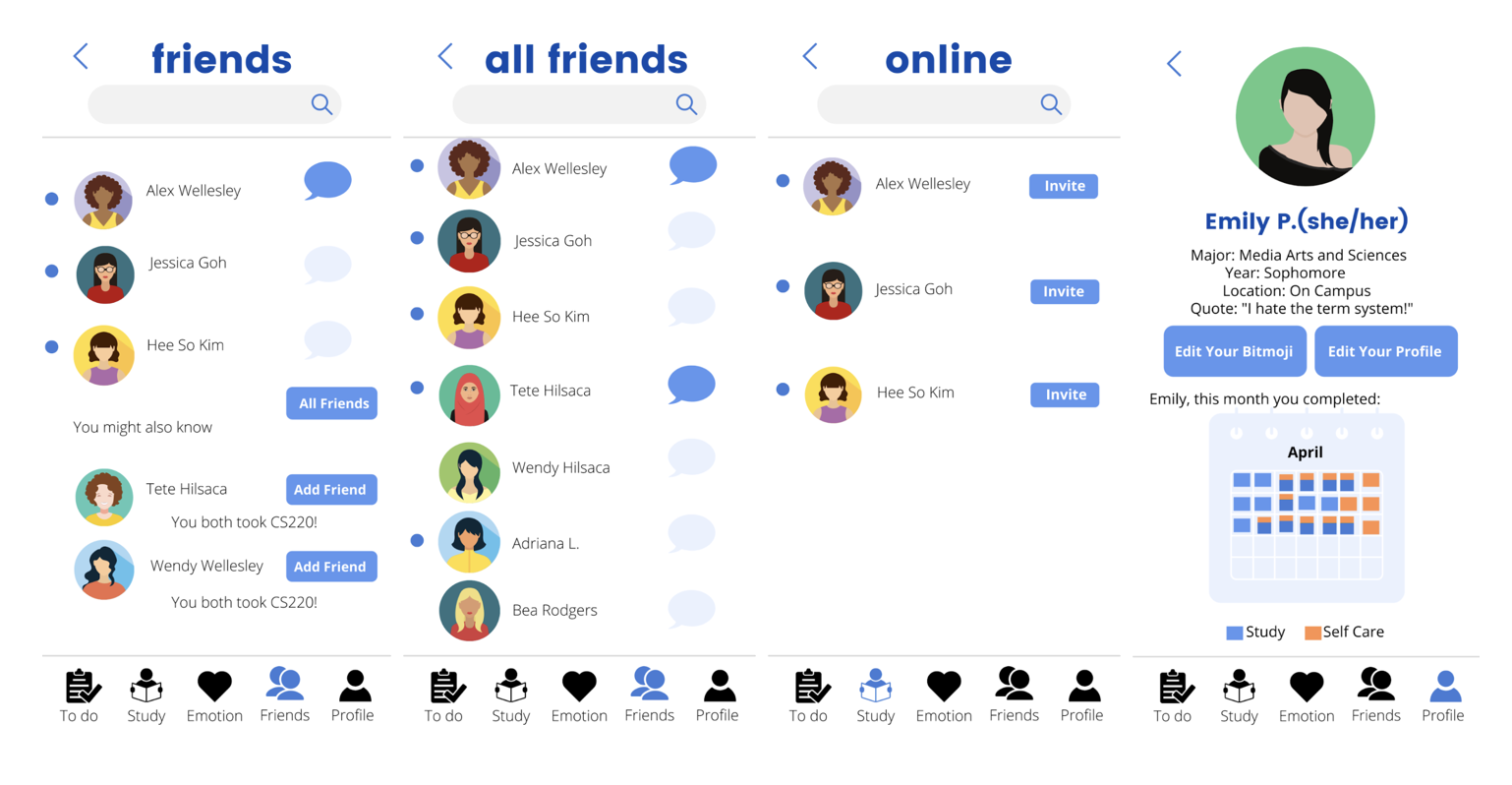
On the Friends page, users can see which friends are online, chat within the app, and find new friends based on the app's suggestions. On the profile page, users can edit their profile and track their progress for the month.
Takeaways from usability and heuristic user evaluations
Emotional Calendar Changes: Moved the emotion calendar from the profile to the self care homepage for better consistency and easier access. Color coded emotion calendar buttons.
App Flow: Instead of using the ‘home’ icon that brings users back to landing page, we added either study/self care for users to switch back and forth between routes and to emphasize that the app has two main features.
Menu Bar Icon Size: Resized menu bar icons so that it doesn’t look as aggressive and to avoid clutter.
Changes We Considered: Evaluators commented that having two different menu bars in the self care and productivity routes could be a cognitive load. However, we decided that having separate menu bars were necessary to emphasize that the app has different routes.


