Bondit (bondit.io) is a Social Networking Service (SNS) mobile application for US college students that has approximately 20,000 users at the moment. The final version released on October 26th 2021.
role: UX Researcher
team: 4 Designers
tools: Figma, Miro, AdobeXD, Balsamiq, and Zoom
During summer 2021 I was part of the team responsible of rebranding and revamping the User Experience of the Bondit to increase the rate of its Daily Active Users (DAU). The final version released this October 26 2021.
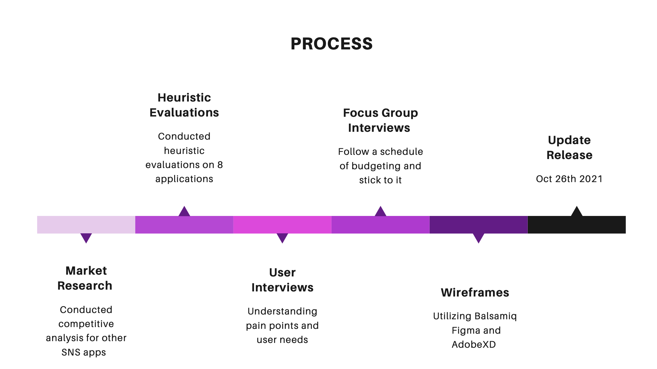
based on user interviews..
We were able to learn that most college students look for similar interests when talking to new people.They like the idea of location system but are worried it being not safe. Most users feel like Bondit overlaps other SNS application. They have hard time meeting new people due to COVID, which makes them search friends online.
focus group Interviews.
Many college students from all years feel excited about connecting with people and networking for their career advancement. However, many feel insecure about sharing their specific location and personal information like their dorm. They feel at most like we are in a time that we can easily connect and network with people online.
my experience
I was the lead interviewer of two focus groups consisting of 5-8 interviewees each. I learned to embrace silence and let interviewees take their time evaluate their responses. The interviews ended up taking approximately an hour and our team was able to further understand what college students were looking for in social media applications.
wireframes
Based on user research, we analyzed that the main features college students are looking for in social media are ways to find friends with common interests. We also noted that one of the most favored Bondit feature is the location feature. Based on this, we used interests as the major algorithm when suggesting other users to bond with and when users are searching for friends, we added an interest bar to allow them to search by common interests.
The changes my team implemented:
Removed “Notifications” as a main page
Modified location to list people “## miles away from you”
Modified “BlueBox” to include users with similar interests
The new features added in our wireframes:
Users are able to explore student clubs through the “Campus Groups” feature
Upgraded the location feature by allowing the users to view new events directly on the map and get event suggestions based on their location
Added a story feature called “Bondit Bomb”
Added a button on the bottom menu to create a new post
Users are able to categorize what friends to be bonded with (ex. Gym buddy, study mate)
A new feature the “time table” was created and it was my teams job to work on its information architecture

challenges and takeaways
time zones
I was part of a very diverse team coming from all over the world. Given our time differences, sometimes I had to meet with them at the break of dawn or in the middle of the night. This meant that I had to be comfortable with working on a bizarre schedule.
my team
I learned that when working as a team, we achieved the best results. When we first got assigned to create wireframes we all did individual projects, when we came together we gathered the best ideas from each and together formed one prototype that best fit our users. We also learned from each other, one of our assignments, creating Heuristic Evaluations we had to evaluate more than 10 social media applications. Even though we divided the work we all shared information and readings from our Human Computer Interaction courses to better understand our assignment.
iterate, iterate, iterate
User input is the best way of knowing we are going in the best direction. I am glad I had the opportunity of working in user interviews, focus group interviews, and working with responses from surveys of more than 500 students.


